Clearly: the online eyewear store
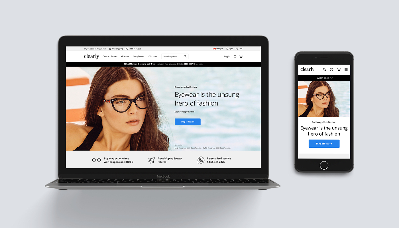
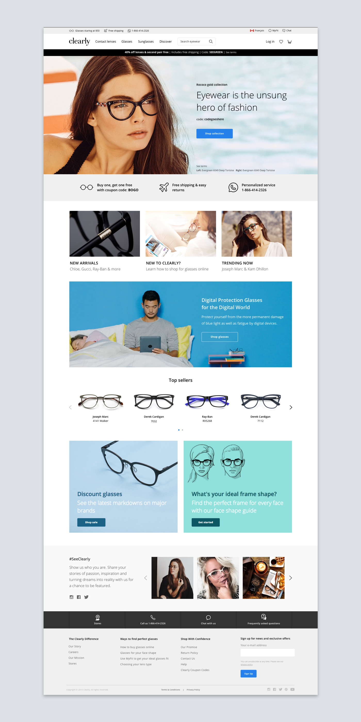
Clearly is an online retailer of contact lenses, eyeglasses and sunglasses. They are one of the largest online contact lens retailers in North America, and the largest seller of prescription eyeglasses online in the world. I redesigned the corporate website to optimize user experience by creating reusable templates and components for the content management system, and therefore offering customers a more intimate online shopping experience.
Objective
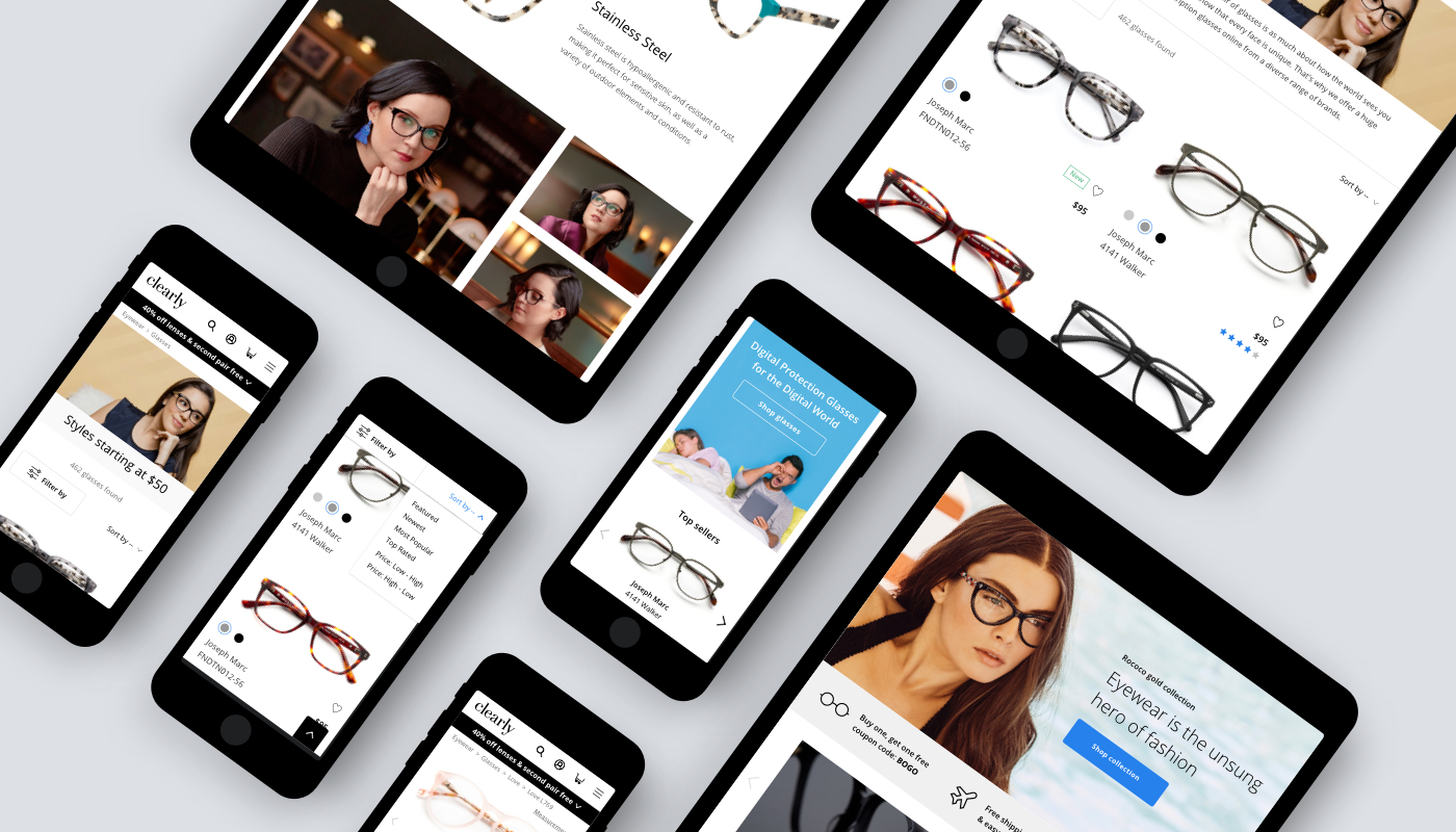
At a conventional brick and mortar store, people would be able to walk in, greeted, and be told of what the promotion is. Also, people would be able to shop around and pick up and examine individual glasses, and feel the material and try it on, relieving people of any fit concern they might have. The goal is to replicate similar experience using visual elements (images, interactions and content). Also, to built a platform easy for the business team to maintain.
Building CMS components
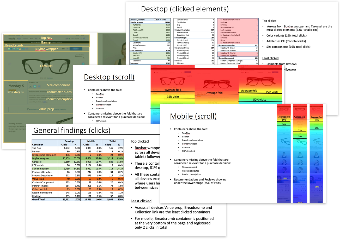
Although content management system is in place, raw HTML components were being used because it provides more flexibility. Also, there were clear lack of consistency between the rules of components and naming conventions.
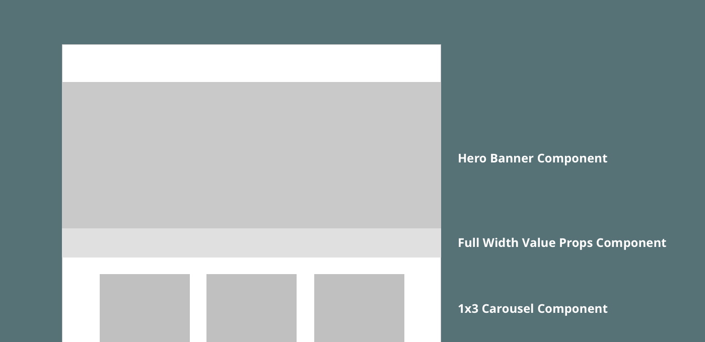

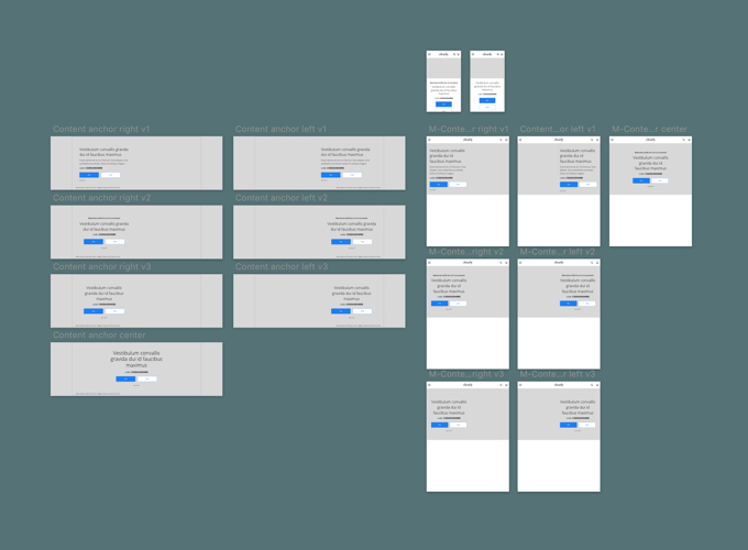
Name each component comprehensively.
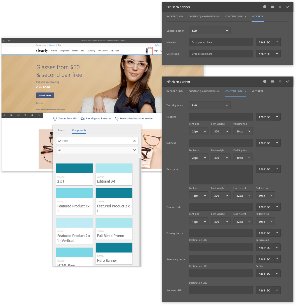
Provide more options and flexibilities within component configuration settings.
Each component is designed to be flexible in font sizes, line heights, text alignment, colours, and background options so to serve the various needs of the marketing department.
Design
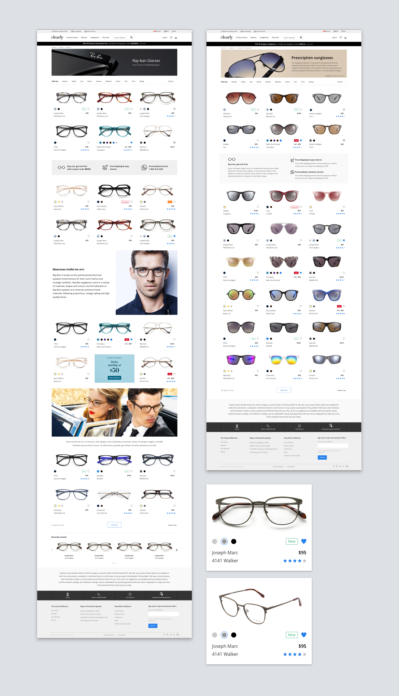
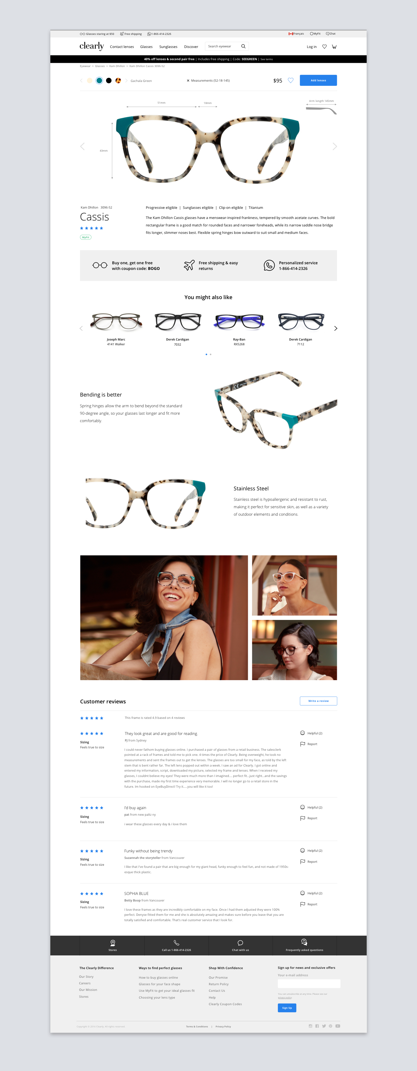
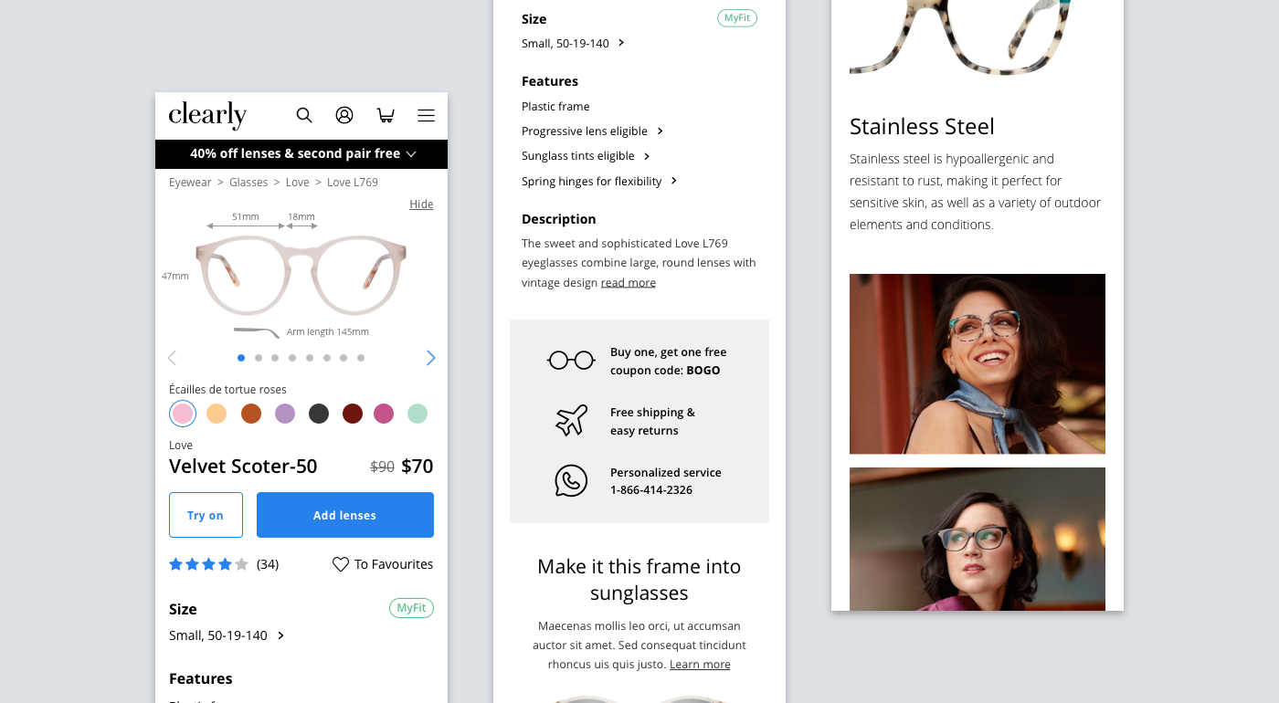
Product page
A sticky bar with colour choices, measurements, price, and a “buy button” addresses customer’s buying behaviour of going back and forth between different colours to find the favourite. Also, by having readily available “measurement” CTA, customers can always check for fit. Having “buy CTA” ensures little friction towards purchasing.